Ciao ragazze, protagoniste di questo post sono le borse.
|
Hi girls, this post is all
about bags.
|
Non possiamo assolutamente uscire senza di lei e quindi
sapete quali sono i modelli must have per questo freddo inverno 2017?
|
We can’t really leave home
without it so do you want to know this freezing winter must haves bags?
|
Il secchiello. Lo zaino e la tote bag in velluto.
|
The bucket bag, the backpack and the velvet tote bag.
|

Elle Fanning for Marc Jacobs
|
|
LA BORSA A
SECCHIELLO
|
THE BUCKET BAG
|
La borsa a secchiello è un modello evergreen e in questo
momento sta riscuotendo un discreto successo.
|
The bucket Bags is a timeless
shape and its appreciation seems now revived.
|
Io non lo amo particolarmente ma sembra proprio che per
questo inverno lo porteremo in taglia mignon!
|
I don’t particularly fancy
this bag's’ shape but it seems that this winter we will wear it and in the small size nevertheless!
|

voyage-regine by MARK JACOBS

Blue Bucket Bag By MICHAEL KORS

faux leather sachel by H&M

cobalt blue backet bag by MANGO
|
|
LO ZAINO
|
THE
BACKPACK
|
Lo zaino è sicuramente sinonimo di praticità attenzione
però non mi riferisco agli zaini che usavamo per andare a scuola bensì a dei
modelli fashion e di tendenza che vale la pena prendere in considerazione.
|
Backpack means comfort for
sure, however I’m not talking about school backpacks but fashion, trendy bags that are absolutely worth
considering.
|

navy lambskin backpack by CHANEL

convertible faux leather backpack by ZARA

black with golden buckle backpack in faux leather by ZARA

Funny faux leather backpack by ACCESSORIZE

palm spring packpack by LOUIS VUITTON
|
|
Io prediligo uno zaino nero in pelle, è un colore più
facile da abbinare e lo si adatta facilmente ad ogni occasione d'uso, al
massimo una tonalità cognac o sulle sfumature del bronzo.
|
I favor it in black leather,
cognac or in a copper hue: this colors are easy to match and just perfect for
any occasion.
|
LA TOTE
BAG IN VELLUTO
|
THE VELVET TOTE BAG
|
Trend assoluto per questa stagione fredda è proprio lui: il
velluto.
|
The real trend of this
season though is velvet.
|
Al contrario di quello che si pensa, il velluto non si
addice solo a look da sera oppure formali ma si addice anche ad un look da
giorno in n quanto può impreziosire l'outfit che indossate, indipendentemente
dal fatto che andate a lavoro oppure uscite per il tempo libero.
|
Differently from what one
may think, velvet is not only for evenings or formal occasions: it suits a
day outfit too since it can enhance your outfit no matter what it is for your leisure time or the working hours.
|
In inverno diventa tutto più semplice, basta avere un bel cappotto, delle belle scarpe ed una borsa alla moda per risolvere il problema del cosa mi metto. Basta ricordare quanta cura le nostre nonne mettevano nello scegliere il cappotto ma soprattutto la borsa che poi avrebbero indossato per tutto l' inverno! |
In winter everything is a lot easier, a nice coat, a fancy pair of shoes and a stilysh bag just make do and solve the eternal "what will I wear tomorrow?" question. We shall remember just how carefully our grandmothers chose the coat and bag they'd wear forthe whole season! |
mercoledì 25 gennaio 2017
WINTER 2017 BAGS - FASHION TRENDS


mercoledì 21 dicembre 2016
UNWRAPPING GIFT - or the Christmas pajama outfit
Christmas is all
about tradition and I have one of my own……being amazing in my pajama while
unwrapping gifts or having breakfast with my family. Since usually on
Christmas you either have guests staying or you sleep over, be fashionable
and “seasonal” in your pj is a must.
|
Natale è tempo di tradizioni ed io ne ho una tutta mia…..essere favolosa con il mio pigiama quando scarto i regali o faccio colazione con la mia famiglia. Visto che a Natale si potrebbero avere ospiti che restano a dormire o
si dorme fuori casa, essere fashion e “a tema” con il proprio pigiama è d’obbligo.
|
 |
|
We have two options:
the Christmas pajama (nothing says Christmas like Santa’s big bearded face
printed on your shirt) or something very winter-y with a touch of red. If the
second case suits you better, I’d suggest a red plaid pajama trousers coupled
with a simple long sleeve shirt in blue or green depending on the pattern of
the trousers.
|
Ci si presentano due possibilità: il pigiama natalizio (niente dice
Natale come la facciona barbuta di Babbo natale stampata su una maglietta) o
qualcosa di invernal-oso con un tocco di rosso. Se siete per la seconda opzione,
vi suggerisco di indossare dei pantaloni a quadri con del rosso abbinati ad
una maglietta con le maniche lunghe blu o verde a seconda della stampa del
pantalone.
|
   |
|
While
unwrapping you may be more comfortable
and cozy by adding a layer, a loose fitting cardigan will do. Also it will
help you not to burn your hands on the macchiato cup you’ll surely have while
sitting on the couch and watching a Christmas movie (or cartoon).
|
Mentre aprite i regali potreste sentirvi più a vostro agio e
confortevoli con una latro capo indosso, un cardigan che veste grande farà al caso vostro.
E poi sarà utile per non scottarvi le mani con la tazza di caffellatte che
sicuramente avrete fra le mani mentre guardate il film (o un cartone) di
Natale sul divano.
|
It’s been since I
was a kid that I didn’t wait for Christmas morning to open the presents but the
moment midnight strikes I have my hands on all the boxes with my name on ‘em.
That means in all the photos where my family and I unwrap presents no one is
wearing a pajama (does grandma count?).
|
È da quando ero piccolina che non aspetto la mattina di Natale per
aprire i regali ma non appena scatta la mezzanotte, afferro tutti i pacchetti
con il mio nome sopra. Questo vuole ovviamente dire che in tutte le foto di famiglia in
cui scartiamo i regali, nessuno di noi indossa il pigiama.
|
So why writing a
post about pajamas and unwrapping gifts?
Well, because in this time of Facebook and Twitter, when we all post photos of the dinner table, the presents, the dog with Santa’s hat (seriously poor pets) and all the silliness you can think of, I may take some Christmas morning shoots with my beloved and post them (or they could). |
Quindi perché scrivere un post su pigiami e scartare regali?
Beh, perché nell’epoca di Facebook e Twitter, quando tutti pubblichiamo foto della tavola apparecchiata, dei regali, del cane con il cappello di Babbo Natele (no, davvero, povera creatura) e di tutte le fesserie che vi possono venire in mente, io potrei fare alcune foto natalizie mattutine con i miei cari e postarle (o potrebbero farlo loro). |
 ABC Family - Pretty Little Liars |
|
The fact is, no
matter the occasion, if you take a picture (or someone does it) and you know
that picture wil be posted, then you want to look good in them (as far as you
can in a pajama at least).
|
In sostanza, non importa quale sia l’occasione, se fate una foto
(o la scatta qualcun’altro) e sapete che sarà pubblicata, allora volete
venire bene (per quanto questo sia possibile indossando un pigiama).
|
In any case, especially
if photos are in order, we simply want to look nice no matter what.
|
Comunque sia, specialmente quando si tratta di foto, vogliamo tutti
apparire carini.
|
 |
|
Back on our topic,
if you want to look more easygoing or you are really not into all the Christmas
nonsense , you may simply put on your favorite pajama and smile for the
camera.
|
Tornando al nocciolo della questione, se volete apparire più naturali
o non siete per tutte queste fesserie natalizie, potete semplicemente
indossare il vostro pigiama preferito e sorridere all’obiettivo.
|

DISNEY - Cinderella
|
|
Last but not least,
you don’t want to have a nice pajama outfit and then look like a mess. I suggest you to comb your hair in a loose braid and add
a touch of cocoa butter: remember no lipstick or make-up whatsoever,
supposedly you just woke up from your (beauty) sleep.
|
Ultimo, ma non per importanza, non vorrete certo essere ben vestite con il vostro pigiama e poi essere un disastro voi. Il mio suggerimento è di
acconciare i capelli in una treccia morbida e mettervi giusto un velo di
burro cacao: ricordate, assolutamente niente trucco o lucidalabbra,
teoricamente vi siete appena svegliate dal vostro sonno (di bellezza).
|

DISNEY - Frozen
|
|
I already made a
post about pajamas (you can check it out here) and I think it may be useful for Christmas too.
|
Ho già scritto un
post sui pigiami (potete darci un’occhiatina qui) che potrebbe esservi utile
anche per Natale.
|
The only thing I
want to add to it is that, since it is Christmas time after all, you may want
to have a Christmas accessory on you and wear your most welcoming smile.
|
Voglio solo aggiungere che, visto che è Natale dopo tutto, potreste
aggiungere un accessorio a tema ed indossare il vostro sorriso più dolce.
|
 |
|
Have a nice
fashionable Christmas!!!
Lots of love
Sara
|
Buon Natale
fashion!!
Con affetto
Sara
|

venerdì 9 dicembre 2016
PANTONE® 2017 SPRING-SUMMER PALETTE IS FINALLY HERE
Xmas is not here yet and we already have the 2017spring/summer
PANTONE® palette.
I must say it may be one of my favorite palette
ever.
|
Natale non è ancora
arrivato e la PANTONE® ha già rilasciato la palette per la stagione
primavera/estate 2017 che, devo proprio dire, potrebbe rivelarsi una delle
mie preferite di sempre.
|
Surely some colors are more vivid than others but
the overall effect is very classic-ish and elegant. It is not as “pastel” as
it was last year but the colors are evergreen nuances we probably already
have in our closet.
|
Certamente alcuni colori
sono più accesi di altri ma l’effetto complessivo è classicheggiante ed
elegante. Non è così “pastello” come l’anno scorso ma i colori sono delle
sfumature sempre attuali che probabilmente già avete nei vostri armadi.
|
I think this here PANTONE® challenge will be how to
mix and match this wonderful palette.
|
Penso che la sfida della PANTONE®di
quest’anno sia - come - abbinare questa meravigliosa palette.
|
The top colors
for Spring 2017 fashion are:
|
I colori principali della
Primavera 2017 sono:
|
 |
|
Let’s examine them one by one
|
Ma esaminiamoli uno alla
volta
|
PANTONE® 17-4123 Niagara
|
|
 |
|
Comfortable and dependable, Niagara leads the
PANTONE Fashion Color Report as the most prevalent color for spring 2017.
Niagara is a classic denim-like blue that speaks to
our desire for ease and relaxation.
|
Confortevole e affidabile, Niagara guida il
PANTONE fashion report in quanto il colore prevalente per la primavera 2017.
Niagara è un azzurro denim classico che parla al nostro desiderio di semplicità e relax.
|
 |
|
My considerations on this color:
|
Le mie considerazioni su
questo colore:
|
A dull shade reminding of the blue tipical of the jean trousers.
|
Una tinta leggermente più spenta rispetto alle altre, che ricorda un azzurro molto simile al colore dei jeans.
|
 |
|
PANTONE® 13-0755 Primrose Yellow
|
|
 |
|
By contrast, Primrose Yellow sparkles with heat and
vitality. Inviting us into its instant warmth, this joyful yellow shade takes
us to a destination marked by enthusiasm, good cheer and sunny days.
|
Al contrario, Primrose Giallo
brilla di calore e la vitalità. Invitante nel suo calore
immediato, questa gioiosa sfumatura di giallo ci porta verso mete che risuonano
di entusiamo, buon umore e giornate soleggiate.
|
  |
|
My considerations on this color:
|
Le mie considerazioni su
questo colore:
|
I know it is so last year but I still think this (and PANTONE® 14-4620 Island Paradise) is the perfect nuance for a spring coat or a nice pair of sneakers to pair with a pair of jeans.
|
So che fa tanto “l’anno scorso” ma credo che questo colore (insieme a PANTONE® 14-4620 Island Paradise) sia la sfumatura perfetta per un cappottino di mezza stagione o per un paio di scarpette di tela da abbinare a dei jeans.
|
 |
|
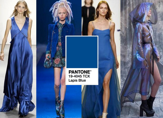
PANTONE® 19-4045 Lapis Blue
|
|
 |
|
Conveying even more energy is Lapis Blue. Strong and
confident, this intense blue shade is imbued with an inner radiance.
|
Lapis Blue trasmette ancora più energia. Forte e
sicuro, questa intensa tonalità blu è intrisa di una luce interiore.
|
 |
|
My considerations on this color:
|
Le mie considerazioni su
questo colore:
|
This is the palette's most elegant nuance. It mirably evokes the wondrous lapis lazuli.
|
Questa è senza dubbio la nuance più elegante della palette. Rievoca i prestigiosi lapislazzuli, meraviglioso.
|
 |
|
PANTONE® 17-1462 Flame
|
|
 |
|
A red-based orange, Flame, is gregarious and fun
loving. Flamboyant and vivacious, this wonderfully theatrical shade adds
fiery heat to the spring 2017 palette.
|
Un arancio a prevalenza di rosso, Flame è
estroverso e amante del divertimento. Appariscente e vivace, questa tonalità grandemente
teatrale aggiunge una sfumatura di calore
ardente alla tavolozza della primavera 2017.
|
 |
|
My considerations on this color:
|
Le mie considerazioni su
questo colore:
|
Bright an cheerful, this color really suites a boho vibe. A red-lobster perfect for tanned skins.
|
Acceso e allegro, questo colore si confà ad una vena boho. Un rosso aragosta, ideale soprattutto quando si è abbronzate.
|
 |
|
PANTONE® 14-4620 Island Paradise
|
|
 |
|
Island Paradise is a refreshing aqua that calls to
mind a change of scenery. A cool blue green shade that speaks to our dream of
the great escape, Island Paradise is emblematic of tropical settings and our
desire to unwind.
|
Paradise Island è un’ acqua rinfrescante che riporta
alla mente un cambiamento di scenario. Una fresca tonalità con accenni di verde
e di blu che parla al nostro desiderio di libertà, Paradise Island è
emblematica di ambienti tropicali e la nostra voglia di rilassarci.
|
  |
|
My considerations on this color:
|
Le mie considerazioni su
questo colore:
|
Cold and evocative of the 50s/60s this color shall
be a nice choice to match a with pair of trousers or a mini skirt next summer.
|
Freddo ed evocative degli
anni 50 e 60, questo colore potrebbe essere abbinato con dei pantaloni o una
minigonna bianca la prossima estate.
|
 |
|
PANTONE® 13-1404 Pale Dogwood
|
|
 |
|
Continuing the tranquil mood, Pale Dogwood is a
quiet and peaceful pink shade that engenders an aura of innocence and purity.
The unobtrusive Pale Dogwood is a subtle pink whose soft touch infuses a
healthy glow.
|
Ed ancora d’umore sereno, Pale Dogwood è una
sfumatura di rosa quieto e sereno che
origina una aura di innocenza e purezza. La sfumatura discreta di Pale Dogwood
è un rosa discreto il cui tocco morbido infonde una luce positiva.
|
 |
|
My considerations on this color:
|
Le mie considerazioni su
questo colore:
|
We cannot have a palette without a pink nuance and this year they gave us a very romantic pink.
|
Non c'è palette senza il rosa e quest'anno ce ne hanno dato uno davvero romantico. Una sorta di rosa cipria, una nuance molto femminile e che ricorda le sfumature del quarzo.
|
  |
|
PANTONE® 15-0343 Greenery
COLOR OF THE YEAR |
|
 |
|
Bringing forth a refreshing take, Greenery is a
tangy yellow-green that speaks to our need to explore, experiment and
reinvent. Illustrative of flourishing foliage, the fertile attributes of
Greenery signals one to take a deep breath, oxygenate and reinvigorate.
|
Con il suo proporre un momento
rinfrescante, Greenery è un giallo-verde speziato che parla al nostro bisogno
di esplorare, sperimentare e reinventare. Evocativo di un fogliame rigoglioso,
gli attributi di fertilità delle note di Greeenery ci portano a fare un respiro
profondo, a prendere ossigeno e rinvigorirci.
|
 |
|
My considerations on this color:
|
Le mie considerazioni su
questo colore:
|
This color reminds me of the english grass, a delicate hue often chosen by brands such as Michael Kors.
|
Questo colore mi ricorda un verde prato inglese, una tinta leggera scelta da marchi come Michael Kors.
|
  |
|
PANTONE® 17-2034 Pink Yarrow
|
|
 |
|
Tropical and festive, Pink Yarrow is a whimsical,
unignorable hue that tempts and tantalizes. Bold, attention getting and
tempestuous, the lively Pink Yarrow is a captivating and stimulating color
that lifts spirits and gets the adrenaline going.
|
Tropicale e festoso, Pink Yarrow è una tonalità caprocciosa e che non passa inosservata, seduce ed induce in tentazione. Sfrontata, capace di catalizzare l'attenzione e tempestosa il vivace Pink Yarrow è un colore accattivante e stimolante che solleva gli spiriti ed innalza il picco dell'adrenalina.
|
 |
|
My considerations on this color:
|
Le mie considerazioni su
questo colore:
|
A surely unignorable hue, a vivid fuxia reminding of the 80s style. Often preferred by Maisons as Hermes or Valentino.
|
Una nuance che sicuramente non passa inosservata, un vivacissimo fucsia che ci ricorda la moda degli anni '80. Scelto da maison come Hermes e Valentino.
|
 |
|
PANTONE®
18-0107 Kale
|
|
 |
|
Evocative of the great outdoors and a healthy
lifestyle, Kale is another foliage-based green that conjures up our desire to
connect to nature, similar to the more vivacious Greenery. And, just as we
see in nature, this lush and fertile natural green shade provides the perfect
complementary background to the more vibrant tones in the palette.
|
Evocativo di suggestioni di
spazi aperti e di uno stile di vita sano, Kale è un altro verde-foglia che,
similarmente al più vivace Greenery, richiama il desiderio di riconnettersi
alla natura. Ed esattamente come avviene in natura, questa sfumatura di verde
lussureggiante e fertile si offre come colore complementare perfetto per le
tinte più accese presenti nella palette.
|
 |
|
My considerations on this color:
|
Le mie considerazioni su
questo colore:
|
Reminding me of olive green but with a mossy texture this color will suit tomboys and
classic girls as well.
|
Ammiccante al verde olive ma
con una sfumatura muschiata, questo colore si adatta bene a ragazze dal look
mascolino così come a chi veste più classico.
|
 |
|
PANTONE®
14-1315 Hazelnut
|
|
 |
|
Rounding out the spring 2017 colors is Hazelnut, a
key neutral for spring. This shade brings to mind a natural earthiness.
Unpretentious and with an inherent warmth, Hazelnut is a transitional color
that effortlessly connects the seasons.
|
A completare le sfumature per
la primavera 2017 arriva Hezelnut, un
colore neutro essenziale per la primavera. Questa sfumatura riporta alla mente un che di
naturale e legato alla terra. Modesto e dotato di note calde, Hezelnut è un colore di transizione che si adatta
senza sforzo al passaggio tra una stagione e l’altra.
|
 |
|
My considerations on this color:
|
Le mie considerazioni su
questo colore:
|
A nuance somewhere in between beige and dusty pink
is a neutral pattern that goes with almost any color and can make even a
modern interiors look warm.
|
Una sfumatura tra il beige
ed il rosa polvere, è una tonalità neutra che si abbina facilmente con quasi
tutti i colori e che può rendere accogliente anche un arredamento moderno.
|
  |
|
What's your favorite color?
This spring palette allow us to choose between both neutral earthly colors an bright ones (to match with basic itemsof course). It is up to you to mix them or opt for a color block outfit but if you don't know how to match them, the pantone fashion report have a special section dedicated to pairing the palette's color. My favorite pairings are Kale and flame but Hezelnut and Lapis blu are a really chic pairing. |
Quale è il vostro colore preferito?
Questa primavera la palette ci permette di spaziare da colori naturali che richiamano la terra a colori vivaci e brillanti (da abbinare a capi basic naturalmente). Dipende da voi se mischiarli tra di loro oppure optare per un look tinta unita. Comunque sia, se avete dubbi su come abbinarli, il pantone fashion report ha una sezione dedicata all'abbinamento delle tinte stagionali. Il mio abbinamento preferito è Kale con Flame ma Hezelnut e Lapis Blu sono un abbinamento davvero chic. |
Iscriviti a:
Commenti (Atom)