|
Hello
girls, I thought it could be a nice idea to show you the list of the top ten
colors for the fall 2015 as chosen by
the stylists for the New York fashion week and presented by the PANTONE© institute.
|
Ciao ragazze, ho pensato che sarebbe stata una
bella idea proporvi la lista della top dei colori scelti dagli stilisti per
il New York fashion week dell’autunno 2015 e presentati dalla PANTONE©
institute
|
||||||
|
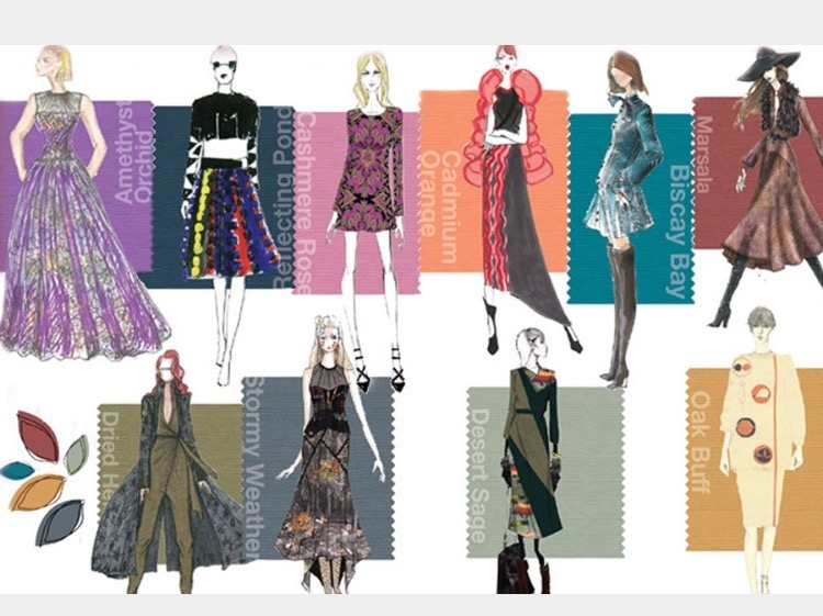
1 - DRIED HERB
 |
|||||||
|
An
olive green once thought of as strictly safari or military, Dried Herb is elevated this season to
be sophisticated and chic. Closely related to nature, Dried Herb is an
organic shade redolent of nature’s earthy fragrances.
|
Un verde oliva un tempo immaginato come un colore
per i militari o da safari, Dried Herb,
questa stagione è elevato a sofisticato e chic. Strettamente legato alla
natura, erba secca è una sfumatura organica che ricorda i profumi naturali
della terra.
|
||||||

2 - DESERT SAGE
 |
|||||||
|
The
importance of neutrals continues to evolve with Desert Sage, a cool and soothing greenish-gray that serves as the
ideal neutral across the Fall 2015 palette. Timeless and unobtrusive, yet
powerful enough to make a statement on its own, Desert Sage speaks to the
feeling of naturally inspired colors that remind us of things that are real
and not invented.
|
L'importanza dei neutri continua ad evolversi con
Desert Sage, un grigio- verdastro
fresco e rilassante che si pone come il neutro ideale per la palette dell’autunno
2015. Discreto e senza tempo, ma abbastanza intenso da farsi notare da solo,
Desert Sage evoca la sensazione dei colori ispirati alla natura che rievocano
cose reali e non fabbricate.
|
||||||

3 - STORMY WEATHER
 |
|||||||
|
Reminiscent
of the sky on a gray, overcast day, Stormy
Weather is dependable, cool and above all, constant. Implying quality and
luxury, it is a powerful blue-gray that is strong, protective and enduring.
|
Evocativo del cielo in un giorno grigio e
nuvoloso, Stormy Weather è un
colore non impegnativo, fresco e soprattutto, una costante. Richiama qualità e lusso, è un accesso
blu-grigio, protettivo e duraturo.
|
||||||

4 - OAK BUFF
 |
|||||||
|
Just
as the sun comes out after stormy weather to bring us cheer and a glimmer of
hope, Oak Buff is a mellow,
comforting and warming shade that brings good feelings.
|
Proprio come il sole che esce dopo una tempesta per portarci allegria ed un
barlume di speranza, Oak Buff è
una sfumatura calda, morbida e che ci evoca sentimenti positivi.
|
||||||

5 - MARSALA
 |
|||||||
|
Rich
and robust, Marsala incorporates
the warmth and richness of a tastefully fulfilling meal, while its grounding
red-brown roots point to a sophisticated, natural earthiness.
|
Ricco e robusto, Marsala
incorpora il calore e la suntuosità di un pasto dal gusto appagante, mentre
la sua base rosso-marrone richiama la terra in maniera sofisticata e
naturale.
|
||||||

6 - BISCAY BAY
 |
|||||||
|
A
lush and elegant teal, Biscay Bay
splashes up against more heated tones with its cool touch, combining the
serene qualities of blue with the invigorating aspects of green. This cool
and confident tone inspires thoughts of soothing tropical waters,
transporting us to a place that is pleasant and inviting.
|
Un grigio-verde lussureggiante ed elegante, Biscay Bay è un tocco fresco in contrasto con i
toni caldi grazie al suo tono freddo; combina gli aspetti di serenità del blu
con gli aspetti rivitalizzanti del verde. Questo colore fresco e deciso
riporta alla mente le rilassanti acque tropicali, trasportandoci in un luogo
piacevole e invitante.
|
||||||

7 - REFLECTING POND
 |
|||||||
|
Thoughtful,
contemplative and composed, Reflecting
Pond is a cooling blue that adds dimension and intrigue to the Top 10.
Conveying a message of credibility, Reflecting Pond is a serious shade that
speaks to the need for stability and security.
|
Riflessivo, contemplativo e rasserenante, Reflecting Pond è un blu tal tono
freddo che aggiunge spessore e fascino alla Top 10. Trasmettendo un messaggio
di credibilità, Reflecting Pond è una
tonalità scura che parla di bisogno di stabilità e di sicurezza.
|
||||||

8 - CADMIUM ORANGE
9 - CASHMERE ROSE
 |
|||||||
|
A
play on the ‘60s with a twist of today, luxurious Cashmere Rose is a tactile and soft pink hue that renders exactly
what it promises. Cultivated in its richness, Cashmere Rose displays a gently
persuasive and composed pink that is more upscale than downtown.
|
Un richiamo agli anni '60 con un tocco di
modernità, il lussuoso Cashmere Rose
è una tonalità tenue e tattile del rosa
che esprime esattamente quello che evoca.
Sofisticato nella sua ricchezza, Cashmere Rose si
rivela un rosa dolcemente persuasivo e
rilassante, che è ricorda più i quartieri alti che centro città.
|
||||||

10 - AMETHYST ORCHID
 |
|||||||
|
Indicative
of our affection for color, Amethyst
Orchid is the jewel in the crown of the Fall 2015 palette. Intriguing,
vibrant and somewhat sensual, this enigmatic shade is an extraordinary hue
that is unique, bold, creative and exciting.
|
Indicativo della nostra passione per il colore, Amethyst Orchid è il fiore
all'occhiello della palette dell’autunno. Intrigante, vivace e in qualche
misura sensuale, questa tonalità enigmatica è una sfumatura straordinaria che
è unica, audace, creativa e stimolante.
|
||||||
 |
|||||||
|
I
hope this colors were inspiring. Mix as you like but remember to choose the right color for your complexion
and, above all, the ones who suits your personality. The good thing about
having so many colors it is that you can be stylish and, at the same time, be
true to yourself.
|
Spero che questi colori vi abbiano ispirato. Abbinateli
come volete ma ricordate di scegliere il colore giusto per il vostro
incarnato e, soprattutto, quello che più si adatta alla vostra personalità.
La cosa buona di avere così tanti colori è che potete essere alla moda e, al
contempo, essere voi stesse.
|
||||||
domenica 11 ottobre 2015
PANTONE© FALL 2015 PALETTE COLOR BY COLOR


WHICH PANTONE® WILL YOU WEAR THIS FALL 2015
Leatrice Eiseman, the Executive Director of the Pantone Color
Institute presented the most prominent hues color for the incoming fall 2015.
This year has been a long homage to the most significative of the last
century’s decades.
Where the summer style was romantic and hyppy-ish, this fall will
highlights geometric design without forgetting the military or male cuts. It’
s like in Disney’s Pochaontas song “can you paint with all the colours of the
wind?”.
Natural is the key word. We will wear earthly, natural tones together
with statement bold colours.
|
Leatrice Eiseman, il direttore
esecutivo
del Pantone® Institute ha presentato le
tinte di maggior rilievo
dell’ormai
prossimo autunno 2015.
Quest’anno è stato un lungo omaggio
alle decadi più significative dello
scorso secolo.
Laddove lo stile dell’estate era
romantico
e vagamente Hippie, questo autunno
verranno messi in evidenza
design
geometrici accompagnati da tagli
militari o maschili.
È un pochino come nella canzone
del film
della Disney Pochaontas
“Puoi colorare con tutti i colori
del vento?”.
Naturale è la parola chiave.
Indosseremo colori dai toni
della terra, toni naturali associati
a colori
d’impatto.
|
||||||||||


|
|||||||||||


domenica 4 ottobre 2015
MODERN PREPPY STYLE: smart and elegant (sofisticato ed elegante)


Iscriviti a:
Post (Atom)