domenica 11 ottobre 2015

WHICH PANTONE® WILL YOU WEAR THIS FALL 2015


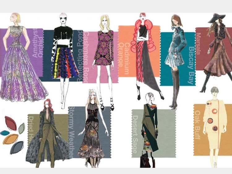
Leatrice Eiseman, the Executive Director of the Pantone Color Institute presented the most prominent hues color for the incoming fall 2015.
This year has been a long homage to the most significative of the last century’s decades.
Where the summer style was romantic and hyppy-ish, this fall will highlights geometric design without forgetting the military or male cuts. It’ s like in Disney’s Pochaontas song “can you paint with all the colours of the wind?”.
Natural is the key word. We will wear earthly, natural tones together with statement bold colours.

Leatrice Eiseman, il direttore esecutivo 
del Pantone® Institute ha presentato le
 tinte di maggior rilievo dell’ormai 
prossimo autunno 2015.
Quest’anno è stato un lungo omaggio
alle decadi più significative dello 
scorso secolo.
Laddove lo stile dell’estate era romantico 
e vagamente Hippie, questo autunno 
verranno messi in evidenza design 
geometrici accompagnati da tagli 
militari o maschili.
È un pochino come nella canzone 
del film della Disney Pochaontas 
“Puoi colorare con tutti i colori 
del vento?”.
Naturale è la parola chiave. 
 Indosseremo colori dai toni 
della terra, toni naturali associati
 a colori d’impatto.


Let’s make a step back, if you are familiar with graphic software, you probably already know what PANTONE® is.
PANTONE®  is a well-known palette of colours that we use in many areas to refer to a specific point of the spectrum of the light frequency, in other words, a specific shade of a colour.
I mean, in physic, if you like the frequency between 700 and 790 THz then you simply like the colour red.
But, there are as many reds as the numbers included between 700 and 790 (give or take). It’s all about shades.
In  PANTONE®  language, to refer to a specific hue of red,  like the one in the children’s markers box, you’d say 19-1664 or TRUE RED.
Some PANTONE® palette’s tones are just numbers, others earned a name.
Ma facciamo un passo indietro, se avete familiarità con i software per la grafica, probabilmente già sapete cosa è PANTONE®.
PANTONE® è una rinomata tavolozza di colori utilizzata in molti campi per fare riferimento ad una specifica frequenza dello spettro della luce, in altre parole, ad una specifica sfumatura di colore.
Voglio dire, in fisica, se vi piace la frequenza compresa tra 700 e 790 THz, semplicemente vi piace il colore rosso.
Ma ci sono tanti punti di rosso quanti i numeri compresi tra 700 e 790 (più o meno). È questione di sfumature.
Nel linguaggio della PANTONE®, per far riferimento ad uno specifico punto di rosso, ad esempio quello che si trova nella scatola dei pennarelli dei bambini, diremmo PANTONE® 19-1664 TRUE RED.
Alcune tinte della tavolozza PANTONE® sono solo dei numeri, ad altre è stato dato un nome.

Let’s say  - for instance – you are into pink (just like me). Which pink do you like?  My favourite pink is PANTONE®  14-1911 - CANDY PINK but yours could easily be the PANTONE®  16-1720 aka STROWBERRY ICE. At the end of the day, as you can see, although we both are into pink, we love two very different tones.
Poniamo l’esempio che vi piaccia il rosa (come a me). Quale rosa vi piace? Il mio rosa preferito è il PANTONE®  14-1911 - CANDY PINK ma il vostro potrebbe tranquillamente essere il PANTONE®  16-1720 ovvero lo STROWBERRY ICE. In fin dei conti, come potete vedere, nonostante amiamo ambedue il rosa, amiamo due tinte alquanto diverse.


For nearly 20 years the PANTONE® , in conjunction with the fashion week has presented the male and female palettes for the incoming spring-summer and fall-winter collections. This year for the first time, they presented just one unisex palette.
This fall, instead of differentiate the chosen nuances by gender, the

            “designers look to sartorial styling and fabrics to define both a masculine and feminine interpretation of hues and color combinations
(MRS Leatrice Eiseman)
This season you’ll be free to ransack your boyfriend’s drawers.
Lots of unisex androgynous colours, effortless and sophisticate to wear. This is also the right season to dare juxtapose colours from the opposite sides of the spectrum. Be bold but remember to stay stylish.
In the next post we will talk a bit about which PANTONE® hues will we wear this fall, one by one.


Da quasi 20 anni la PANTONE®, in concomitanza con il fashion week, presenta le tavolozze dei colori femminili e maschili per le collezioni primavera-estate o autunno-inverno in arrivo. Quest’anno, per la prima volta è stata presentata un’unica palette unisex.
Quest’autunno, invece di differenziare i toni prescelti in base al sesso, i

        “disegnatori guardano allo stile sartoriale ed alla scelta dei tessuti per definire l’interpretazione dei maschile e femminile della combinazione di toni e colori
 (MRS Leatrice Eiseman)
Questa stagione sentitevi libere di saccheggiare i cassetti del vostro ragazzo. Indosserete molti colori unisex ed androgini, facili da indissossare eppure sofisticati. 
L’attuale stagione, inoltre, è il momento adatto per giustapporre colori opposti sullo spettro. Osate ma ricordate di farlo con stile.
Nel prossimo post parleremo di quale sfumatura PANTONE® indosseremo questo 
autunno, una ad una.


Nessun commento:

Posta un commento